Tutorial: Flexbox dividers with positioned labels over top
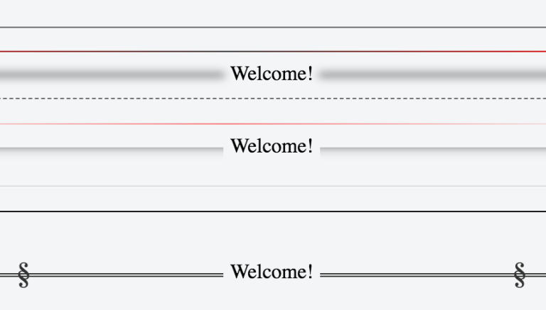
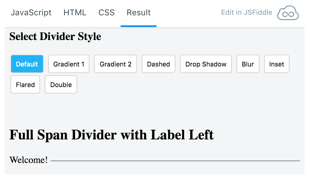
It’s so frustrating to make a horizontal ruler with label text positioned on top of it. There are many different ways to do it but they require a lot of custom CSS that makes it hard for you to easily move the label around to a new position if you need to. I’ve come up with a way to fix that problem using FlexBox and I wanted to share. This JsFiddle will let you select from a few different styles of horizontal rulers, whether it is a full span of fixed width and where the label should be positioned in just a few lines of code. Enjoy!


